Accessibility
Making your app accessible means that people with disabilities are able to use it. There are many nuances to this topic, however in this chapter we are discussing the following disabilities and how you can adapt your app to still make it usable for people with these disabilities:
- Visual impairments including blindness and color blindness
- Difficulty or inability to precisely move a mouse
GTK strives to be accessible by default. Most built-in widgets already expose the right information so that screen readers can read the relevant pieces of information to blind people. However, when you build custom widgets or use widgets in unusual ways, you may need to provide additional information.
Accessible Labels and Descriptions
When a widget doesn’t have visible text, assistive technologies have no way to describe it to users. This commonly happens with icon-only buttons. The solution is to set an accessible label.
Filename: listings/accessibility/1/main.rs
use gtk::prelude::*;
use gtk::{Application, ApplicationWindow, Button, Orientation, accessible, glib};

const APP_ID: &str = "org.gtk_rs.Accessibility1";

fn main() -> glib::ExitCode {
    let app = Application::builder().application_id(APP_ID).build();
    app.connect_activate(build_ui);
    app.run()
}

fn build_ui(app: &Application) {
    let container = gtk::Box::builder()
        .orientation(Orientation::Horizontal)
        .spacing(12)
        .halign(gtk::Align::Center)
        .valign(gtk::Align::Center)
        .build();

    // Icon-only button needs an accessible label
    let search_button = Button::builder()
        .icon_name("system-search-symbolic")
        .build();
    search_button.update_property(&[accessible::Property::Label("Search")]);

    // Add additional context with a description
    let settings_button = Button::builder()
        .icon_name("emblem-system-symbolic")
        .build();
    settings_button.update_property(&[
        accessible::Property::Label("Settings"),
        accessible::Property::Description("Open application preferences"),
    ]);

    container.append(&search_button);
    container.append(&settings_button);

    let window = ApplicationWindow::builder()
        .application(app)
        .title("Icon Buttons")
        .default_width(300)
        .default_height(200)
        .child(&container)
        .build();

    window.present();
}
The update_property method lets you set accessible properties like Label (a short, descriptive name) and Description (additional context).
The Label is what screen readers announce when the widget receives focus.
Filename: listings/accessibility/1/main.rs
use gtk::prelude::*;
use gtk::{Application, ApplicationWindow, Button, Orientation, accessible, glib};

const APP_ID: &str = "org.gtk_rs.Accessibility1";

fn main() -> glib::ExitCode {
    let app = Application::builder().application_id(APP_ID).build();
    app.connect_activate(build_ui);
    app.run()
}

fn build_ui(app: &Application) {
    let container = gtk::Box::builder()
        .orientation(Orientation::Horizontal)
        .spacing(12)
        .halign(gtk::Align::Center)
        .valign(gtk::Align::Center)
        .build();

    // Icon-only button needs an accessible label
    let search_button = Button::builder()
        .icon_name("system-search-symbolic")
        .build();
    search_button.update_property(&[accessible::Property::Label("Search")]);

    // Add additional context with a description
    let settings_button = Button::builder()
        .icon_name("emblem-system-symbolic")
        .build();
    settings_button.update_property(&[
        accessible::Property::Label("Settings"),
        accessible::Property::Description("Open application preferences"),
    ]);

    container.append(&search_button);
    container.append(&settings_button);

    let window = ApplicationWindow::builder()
        .application(app)
        .title("Icon Buttons")
        .default_width(300)
        .default_height(200)
        .child(&container)
        .build();

    window.present();
}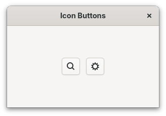
When a widget already has visible text (like a regular button with a label), GTK automatically uses that text as the accessible label. You only need to set it manually for widgets without visible text.
Accessible Relationships
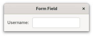
Sometimes widgets are related to each other in ways that help users understand the interface.
For example, a label might describe an adjacent entry field.
You can express this relationship using accessible::Relation.
Filename: listings/accessibility/2/main.rs
use gtk::prelude::*;
use gtk::{
    Application, ApplicationWindow, Entry, Label, Orientation, accessible, glib,
};

const APP_ID: &str = "org.gtk_rs.Accessibility2";

fn main() -> glib::ExitCode {
    let app = Application::builder().application_id(APP_ID).build();
    app.connect_activate(build_ui);
    app.run()
}

fn build_ui(app: &Application) {
    let container = gtk::Box::builder()
        .orientation(Orientation::Horizontal)
        .spacing(12)
        .margin_start(12)
        .margin_end(12)
        .margin_top(12)
        .margin_bottom(12)
        .build();

    let label = Label::new(Some("Username:"));
    let entry = Entry::new();

    // Tell assistive technologies that the entry is labelled by this label
    entry.update_relation(&[accessible::Relation::LabelledBy(&[label.upcast_ref()])]);

    container.append(&label);
    container.append(&entry);

    let window = ApplicationWindow::builder()
        .application(app)
        .title("Form Field")
        .default_width(300)
        .default_height(100)
        .child(&container)
        .build();

    window.present();
}
When a screen reader focuses the entry, it will announce the label’s text, so the user knows what information to enter.
Group related components into a single container to improve navigation for assistive technology users.
For example, place a label and its entry together in a Box, as done above.
Custom Widgets
When creating a custom widget, you are mostly on your own. That includes accessibility. Here’s a quick checklist you can follow:
-
Determine the appropriate role. Set an
AccessibleRolethat matches the widget’s behavior, so assistive technologies know what kind of element it is. -
Update properties when content changes. Keep accessible properties like
LabelandDescriptionin sync with the widget’s visual content. -
Update states when state changes. Reflect dynamic changes using
accessible::State. -
Update relations. Connect the widget to related widgets using accessible relations.
Let’s follow these steps with a custom widget called Custom Button.
Setting the Role
First, we define the subclass and set the accessible role in class_init.
By setting AccessibleRole::Button, screen readers will announce this as a button.
We also set a custom CSS name, so we can style the widget, including a visible focus ring.
The label property will hold the button’s text and is exposed as a GObject property so it can be bound to the inner Label widget.
Filename: listings/accessibility/3/custom_button/imp.rs
use std::cell::RefCell;
use std::sync::OnceLock;

use glib::Properties;
use gtk::gdk;
use gtk::prelude::*;
use gtk::subclass::prelude::*;
use gtk::{AccessibleRole, GestureClick, Label, accessible, glib};

#[derive(Properties, Default)]
#[properties(wrapper_type = super::CustomButton)]
pub struct CustomButton {
    #[property(get, set)]
    label: RefCell<String>,
    child: RefCell<Option<Label>>,
}

#[glib::object_subclass]
impl ObjectSubclass for CustomButton {
    const NAME: &'static str = "CustomButton";
    type Type = super::CustomButton;
    type ParentType = gtk::Widget;

    fn class_init(klass: &mut Self::Class) {
        // Set the accessible role to Button
        klass.set_accessible_role(AccessibleRole::Button);
        klass.set_css_name("custom-button");
        klass.set_layout_manager_type::<gtk::BinLayout>();

        // Bind keyboard shortcuts for activation (Enter and Space)
        klass.add_binding_signal(
            gdk::Key::space,
            gdk::ModifierType::empty(),
            "activate",
        );
        klass.add_binding_signal(
            gdk::Key::KP_Enter,
            gdk::ModifierType::empty(),
            "activate",
        );
        klass.add_binding_signal(
            gdk::Key::Return,
            gdk::ModifierType::empty(),
            "activate",
        );
    }
}

#[glib::derived_properties]
impl ObjectImpl for CustomButton {
    fn signals() -> &'static [glib::subclass::Signal] {
        static SIGNALS: OnceLock<Vec<glib::subclass::Signal>> = OnceLock::new();
        SIGNALS.get_or_init(|| {
            vec![glib::subclass::Signal::builder("activate").action().build()]
        })
    }

    fn constructed(&self) {
        self.parent_constructed();

        let obj = self.obj();
        // Make the widget focusable so keyboard users can reach it
        obj.set_focusable(true);
        // Also allow focusing by clicking
        obj.set_focus_on_click(true);

        // Create a child label and bind its text to our "label" property
        let child = Label::new(None);
        child.set_parent(&*obj);
        obj.update_relation(&[accessible::Relation::LabelledBy(&[child.upcast_ref()])]);
        obj.bind_property("label", &child, "label")
            .sync_create()
            .build();
        self.child.replace(Some(child));

        // Handle click events
        let gesture = GestureClick::new();
        let button = obj.downgrade();
        gesture.connect_released(move |_, _, _, _| {
            if let Some(button) = button.upgrade() {
                button.emit_by_name::<()>("activate", &[]);
            }
        });
        obj.add_controller(gesture);

        // Add an activation handler
        obj.connect_local("activate", false, move |values| {
            let button = values[0].get::<super::CustomButton>().unwrap();
            println!("Button '{}' activated!", button.label());
            None
        });
    }

    fn dispose(&self) {
        while let Some(child) = self.obj().first_child() {
            child.unparent();
        }
    }
}

impl WidgetImpl for CustomButton {}
Focus Ring
A custom widget doesn’t automatically get a visible focus indicator. We need to add CSS that draws one when the widget receives keyboard focus.
Filename: listings/accessibility/3/resources/style.css
custom-button {
    padding: 12px;
    outline: 0 solid transparent;
    outline-offset: 4px;
    transition: outline-color 200ms cubic-bezier(0.25, 0.46, 0.45, 0.94),
                outline-width 200ms cubic-bezier(0.25, 0.46, 0.45, 0.94),
                outline-offset 200ms cubic-bezier(0.25, 0.46, 0.45, 0.94);
}

custom-button:focus:focus-visible {
    outline-color: rgba(53, 132, 228, 0.5);
    outline-width: 2px;
    outline-offset: -2px;
}
Keyboard Navigation
A custom widget built from a non-focusable base like gtk::Widget won’t receive keyboard focus by default.
Setting focusable to true lets users Tab to it, and setting focus_on_click to true also gives it focus when clicked.
The keyboard shortcuts for Enter and Space are bound to the activate signal in class_init, following the same pattern GTK uses for its built-in button.
In constructed, we also create a child Label and use bind_property to keep the child’s text in sync with our label property.
The LabelledBy relation tells assistive technologies that the button is labelled by its child, so screen readers will announce the label text when the button receives focus.
Filename: listings/accessibility/3/custom_button/imp.rs
use std::cell::RefCell;
use std::sync::OnceLock;

use glib::Properties;
use gtk::gdk;
use gtk::prelude::*;
use gtk::subclass::prelude::*;
use gtk::{AccessibleRole, GestureClick, Label, accessible, glib};

#[derive(Properties, Default)]
#[properties(wrapper_type = super::CustomButton)]
pub struct CustomButton {
    #[property(get, set)]
    label: RefCell<String>,
    child: RefCell<Option<Label>>,
}

#[glib::object_subclass]
impl ObjectSubclass for CustomButton {
    const NAME: &'static str = "CustomButton";
    type Type = super::CustomButton;
    type ParentType = gtk::Widget;

    fn class_init(klass: &mut Self::Class) {
        // Set the accessible role to Button
        klass.set_accessible_role(AccessibleRole::Button);
        klass.set_css_name("custom-button");
        klass.set_layout_manager_type::<gtk::BinLayout>();

        // Bind keyboard shortcuts for activation (Enter and Space)
        klass.add_binding_signal(
            gdk::Key::space,
            gdk::ModifierType::empty(),
            "activate",
        );
        klass.add_binding_signal(
            gdk::Key::KP_Enter,
            gdk::ModifierType::empty(),
            "activate",
        );
        klass.add_binding_signal(
            gdk::Key::Return,
            gdk::ModifierType::empty(),
            "activate",
        );
    }
}

#[glib::derived_properties]
impl ObjectImpl for CustomButton {
    fn signals() -> &'static [glib::subclass::Signal] {
        static SIGNALS: OnceLock<Vec<glib::subclass::Signal>> = OnceLock::new();
        SIGNALS.get_or_init(|| {
            vec![glib::subclass::Signal::builder("activate").action().build()]
        })
    }

    fn constructed(&self) {
        self.parent_constructed();

        let obj = self.obj();
        // Make the widget focusable so keyboard users can reach it
        obj.set_focusable(true);
        // Also allow focusing by clicking
        obj.set_focus_on_click(true);

        // Create a child label and bind its text to our "label" property
        let child = Label::new(None);
        child.set_parent(&*obj);
        obj.update_relation(&[accessible::Relation::LabelledBy(&[child.upcast_ref()])]);
        obj.bind_property("label", &child, "label")
            .sync_create()
            .build();
        self.child.replace(Some(child));

        // Handle click events
        let gesture = GestureClick::new();
        let button = obj.downgrade();
        gesture.connect_released(move |_, _, _, _| {
            if let Some(button) = button.upgrade() {
                button.emit_by_name::<()>("activate", &[]);
            }
        });
        obj.add_controller(gesture);

        // Add an activation handler
        obj.connect_local("activate", false, move |values| {
            let button = values[0].get::<super::CustomButton>().unwrap();
            println!("Button '{}' activated!", button.label());
            None
        });
    }

    fn dispose(&self) {
        while let Some(child) = self.obj().first_child() {
            child.unparent();
        }
    }
}

impl WidgetImpl for CustomButton {}
Let’s load the CSS and add two custom buttons in a gtk::Box.
mod custom_button;

use gtk::prelude::*;
use gtk::{Application, ApplicationWindow, CssProvider, Orientation, gdk, gio, glib};

use custom_button::CustomButton;

const APP_ID: &str = "org.gtk_rs.Accessibility3";

fn main() -> glib::ExitCode {
    gio::resources_register_include!("accessibility_3.gresource")
        .expect("Failed to register resources.");

    let app = Application::builder().application_id(APP_ID).build();
    app.connect_startup(|_| load_css());
    app.connect_activate(build_ui);
    app.run()
}

fn load_css() {
    let provider = CssProvider::new();
    provider.load_from_resource("/org/gtk_rs/Accessibility3/style.css");
    gtk::style_context_add_provider_for_display(
        &gdk::Display::default().expect("Could not connect to a display."),
        &provider,
        gtk::STYLE_PROVIDER_PRIORITY_APPLICATION,
    );
}

fn build_ui(app: &Application) {
    let button1 = CustomButton::new("Click me");
    let button2 = CustomButton::new("Or me");
    let container = gtk::Box::new(Orientation::Vertical, 12);
    container.append(&button1);
    container.append(&button2);

    let window = ApplicationWindow::builder()
        .application(app)
        .title("Custom Button")
        .default_width(300)
        .default_height(200)
        .child(&container)
        .build();

    window.present();
}Users can now press Tab to move between custom buttons and press Enter or Space to activate them.
For your own custom widgets, ensure that:
- the focus order is logical. By default, focus follows the widget hierarchy.
- custom keyboard shortcuts are documented and discoverable. Consider adding them to your application’s shortcuts window.
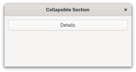
Accessible States
For built-in widgets like CheckButton or Expander, GTK manages states automatically.
When you compose widgets into your own patterns, you need to update the accessible state yourself.
Let’s build a collapsible section. We start with a vertical container:
Filename: listings/accessibility/4/main.rs
use gtk::prelude::*;
use gtk::{
    AccessibleAnnouncementPriority, Application, ApplicationWindow, Button, Label,
    Orientation, Revealer, RevealerTransitionType, accessible, glib,
};

const APP_ID: &str = "org.gtk_rs.Accessibility4";

fn main() -> glib::ExitCode {
    let app = Application::builder().application_id(APP_ID).build();
    app.connect_activate(build_ui);
    app.run()
}

fn build_ui(app: &Application) {
    let container = gtk::Box::builder()
        .orientation(Orientation::Vertical)
        .spacing(6)
        .margin_start(12)
        .margin_end(12)
        .margin_top(12)
        .margin_bottom(12)
        .build();

    // Create a toggle button that controls visibility
    let toggle_button = Button::builder().label("Details").build();

    // The content that will be shown/hidden
    let revealer = Revealer::builder()
        .transition_type(RevealerTransitionType::SlideDown)
        .reveal_child(false)
        .build();
    let content = Label::new(Some(
        "Here are some additional details that can be expanded.",
    ));
    revealer.set_child(Some(&content));

    // Set initial accessible state
    toggle_button.update_state(&[accessible::State::Expanded(Some(false))]);
    toggle_button
        .update_relation(&[accessible::Relation::Controls(&[revealer.upcast_ref()])]);

    // Toggle visibility when clicked
    let revealer_clone = revealer.clone();
    let content_clone = content.clone();
    toggle_button.connect_clicked(move |button| {
        let is_revealed = revealer_clone.reveals_child();
        let new_state = !is_revealed;

        revealer_clone.set_reveal_child(new_state);

        // Update the accessible state to match
        button.update_state(&[accessible::State::Expanded(Some(new_state))]);

        // Update button label and announce the revealed content to screen readers
        if new_state {
            button.set_label("Details (expanded)");
            button.announce(
                &content_clone.label(),
                AccessibleAnnouncementPriority::Medium,
            );
        } else {
            button.set_label("Details");
        }
    });

    container.append(&toggle_button);
    container.append(&revealer);

    let window = ApplicationWindow::builder()
        .application(app)
        .title("Collapsible Section")
        .default_width(350)
        .default_height(200)
        .child(&container)
        .build();

    window.present();
}
Next, create a toggle button and a revealer, then set the initial accessible state and relation.
The accessible::Relation::Controls relation tells assistive technologies that the button controls the revealer.
Filename: listings/accessibility/4/main.rs
use gtk::prelude::*;
use gtk::{
    AccessibleAnnouncementPriority, Application, ApplicationWindow, Button, Label,
    Orientation, Revealer, RevealerTransitionType, accessible, glib,
};

const APP_ID: &str = "org.gtk_rs.Accessibility4";

fn main() -> glib::ExitCode {
    let app = Application::builder().application_id(APP_ID).build();
    app.connect_activate(build_ui);
    app.run()
}

fn build_ui(app: &Application) {
    let container = gtk::Box::builder()
        .orientation(Orientation::Vertical)
        .spacing(6)
        .margin_start(12)
        .margin_end(12)
        .margin_top(12)
        .margin_bottom(12)
        .build();

    // Create a toggle button that controls visibility
    let toggle_button = Button::builder().label("Details").build();

    // The content that will be shown/hidden
    let revealer = Revealer::builder()
        .transition_type(RevealerTransitionType::SlideDown)
        .reveal_child(false)
        .build();
    let content = Label::new(Some(
        "Here are some additional details that can be expanded.",
    ));
    revealer.set_child(Some(&content));

    // Set initial accessible state
    toggle_button.update_state(&[accessible::State::Expanded(Some(false))]);
    toggle_button
        .update_relation(&[accessible::Relation::Controls(&[revealer.upcast_ref()])]);

    // Toggle visibility when clicked
    let revealer_clone = revealer.clone();
    let content_clone = content.clone();
    toggle_button.connect_clicked(move |button| {
        let is_revealed = revealer_clone.reveals_child();
        let new_state = !is_revealed;

        revealer_clone.set_reveal_child(new_state);

        // Update the accessible state to match
        button.update_state(&[accessible::State::Expanded(Some(new_state))]);

        // Update button label and announce the revealed content to screen readers
        if new_state {
            button.set_label("Details (expanded)");
            button.announce(
                &content_clone.label(),
                AccessibleAnnouncementPriority::Medium,
            );
        } else {
            button.set_label("Details");
        }
    });

    container.append(&toggle_button);
    container.append(&revealer);

    let window = ApplicationWindow::builder()
        .application(app)
        .title("Collapsible Section")
        .default_width(350)
        .default_height(200)
        .child(&container)
        .build();

    window.present();
}
When the user clicks the button, we toggle the revealer and update the accessible state to match.
We also use announce to tell screen readers about the newly revealed content:
Filename: listings/accessibility/4/main.rs
use gtk::prelude::*;
use gtk::{
    AccessibleAnnouncementPriority, Application, ApplicationWindow, Button, Label,
    Orientation, Revealer, RevealerTransitionType, accessible, glib,
};

const APP_ID: &str = "org.gtk_rs.Accessibility4";

fn main() -> glib::ExitCode {
    let app = Application::builder().application_id(APP_ID).build();
    app.connect_activate(build_ui);
    app.run()
}

fn build_ui(app: &Application) {
    let container = gtk::Box::builder()
        .orientation(Orientation::Vertical)
        .spacing(6)
        .margin_start(12)
        .margin_end(12)
        .margin_top(12)
        .margin_bottom(12)
        .build();

    // Create a toggle button that controls visibility
    let toggle_button = Button::builder().label("Details").build();

    // The content that will be shown/hidden
    let revealer = Revealer::builder()
        .transition_type(RevealerTransitionType::SlideDown)
        .reveal_child(false)
        .build();
    let content = Label::new(Some(
        "Here are some additional details that can be expanded.",
    ));
    revealer.set_child(Some(&content));

    // Set initial accessible state
    toggle_button.update_state(&[accessible::State::Expanded(Some(false))]);
    toggle_button
        .update_relation(&[accessible::Relation::Controls(&[revealer.upcast_ref()])]);

    // Toggle visibility when clicked
    let revealer_clone = revealer.clone();
    let content_clone = content.clone();
    toggle_button.connect_clicked(move |button| {
        let is_revealed = revealer_clone.reveals_child();
        let new_state = !is_revealed;

        revealer_clone.set_reveal_child(new_state);

        // Update the accessible state to match
        button.update_state(&[accessible::State::Expanded(Some(new_state))]);

        // Update button label and announce the revealed content to screen readers
        if new_state {
            button.set_label("Details (expanded)");
            button.announce(
                &content_clone.label(),
                AccessibleAnnouncementPriority::Medium,
            );
        } else {
            button.set_label("Details");
        }
    });

    container.append(&toggle_button);
    container.append(&revealer);

    let window = ApplicationWindow::builder()
        .application(app)
        .title("Collapsible Section")
        .default_width(350)
        .default_height(200)
        .child(&container)
        .build();

    window.present();
}
Finally, assemble the widgets and present the window:
Filename: listings/accessibility/4/main.rs
use gtk::prelude::*;
use gtk::{
AccessibleAnnouncementPriority, Application, ApplicationWindow, Button, Label,
Orientation, Revealer, RevealerTransitionType, accessible, glib,
};
const APP_ID: &str = "org.gtk_rs.Accessibility4";
fn main() -> glib::ExitCode {
let app = Application::builder().application_id(APP_ID).build();
app.connect_activate(build_ui);
app.run()
}
fn build_ui(app: &Application) {
let container = gtk::Box::builder()
.orientation(Orientation::Vertical)
.spacing(6)
.margin_start(12)
.margin_end(12)
.margin_top(12)
.margin_bottom(12)
.build();
// Create a toggle button that controls visibility
let toggle_button = Button::builder().label("Details").build();
// The content that will be shown/hidden
let revealer = Revealer::builder()
.transition_type(RevealerTransitionType::SlideDown)
.reveal_child(false)
.build();
let content = Label::new(Some(
"Here are some additional details that can be expanded.",
));
revealer.set_child(Some(&content));
// Set initial accessible state
toggle_button.update_state(&[accessible::State::Expanded(Some(false))]);
toggle_button
.update_relation(&[accessible::Relation::Controls(&[revealer.upcast_ref()])]);
// Toggle visibility when clicked
let revealer_clone = revealer.clone();
let content_clone = content.clone();
toggle_button.connect_clicked(move |button| {
let is_revealed = revealer_clone.reveals_child();
let new_state = !is_revealed;
revealer_clone.set_reveal_child(new_state);
// Update the accessible state to match
button.update_state(&[accessible::State::Expanded(Some(new_state))]);
// Update button label and announce the revealed content to screen readers
if new_state {
button.set_label("Details (expanded)");
button.announce(
&content_clone.label(),
AccessibleAnnouncementPriority::Medium,
);
} else {
button.set_label("Details");
}
});
container.append(&toggle_button);
container.append(&revealer);
let window = ApplicationWindow::builder()
.application(app)
.title("Collapsible Section")
.default_width(350)
.default_height(200)
.child(&container)
.build();
window.present();
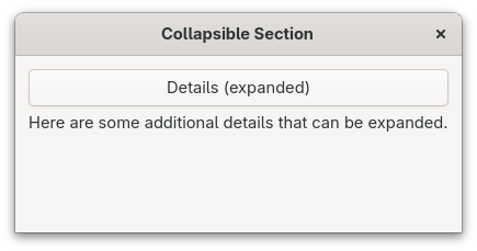
}This is how the app looks like. First in its collapsed, and then in its expanded state.
Don’t Rely on Color Alone
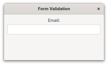
Color should never be the only way to convey information. Let’s demonstrate this with a simple example where we only use color to notify the user about an invalid entry.
First, we should define a function to validate an email address:
Filename: listings/accessibility/5/main.rs
use gtk::prelude::*;
use gtk::{
    Application, ApplicationWindow, Entry, Label, Orientation, accessible, glib,
};

const APP_ID: &str = "org.gtk_rs.Accessibility5";

fn main() -> glib::ExitCode {
    let app = Application::builder().application_id(APP_ID).build();
    app.connect_activate(build_ui);
    app.run()
}

fn is_valid_email(text: &str) -> bool {
    text.contains('@') && text.contains('.')
}

fn build_ui(app: &Application) {
    let container = gtk::Box::builder()
        .orientation(Orientation::Vertical)
        .spacing(6)
        .margin_start(12)
        .margin_end(12)
        .margin_top(12)
        .margin_bottom(12)
        .build();

    let label = Label::new(Some("Email:"));
    let entry = Entry::new();
    entry.update_relation(&[accessible::Relation::LabelledBy(&[label.upcast_ref()])]);

    let error_label = Label::builder()
        .label("Please enter a valid email address")
        .css_classes(["error"])
        .visible(false)
        .build();

    entry.connect_changed(move |entry| {
        let text = entry.text();
        if !text.is_empty() && !is_valid_email(&text) {
            entry.add_css_class("error");
        } else {
            entry.remove_css_class("error");
        }
    });

    container.append(&label);
    container.append(&entry);
    container.append(&error_label);

    let window = ApplicationWindow::builder()
        .application(app)
        .title("Form Validation")
        .default_width(350)
        .default_height(200)
        .child(&container)
        .build();

    window.present();
}
Then, we set up a labeled entry with a hidden error label:
Filename: listings/accessibility/5/main.rs
use gtk::prelude::*;
use gtk::{
    Application, ApplicationWindow, Entry, Label, Orientation, accessible, glib,
};

const APP_ID: &str = "org.gtk_rs.Accessibility5";

fn main() -> glib::ExitCode {
    let app = Application::builder().application_id(APP_ID).build();
    app.connect_activate(build_ui);
    app.run()
}

fn is_valid_email(text: &str) -> bool {
    text.contains('@') && text.contains('.')
}

fn build_ui(app: &Application) {
    let container = gtk::Box::builder()
        .orientation(Orientation::Vertical)
        .spacing(6)
        .margin_start(12)
        .margin_end(12)
        .margin_top(12)
        .margin_bottom(12)
        .build();

    let label = Label::new(Some("Email:"));
    let entry = Entry::new();
    entry.update_relation(&[accessible::Relation::LabelledBy(&[label.upcast_ref()])]);

    let error_label = Label::builder()
        .label("Please enter a valid email address")
        .css_classes(["error"])
        .visible(false)
        .build();

    entry.connect_changed(move |entry| {
        let text = entry.text();
        if !text.is_empty() && !is_valid_email(&text) {
            entry.add_css_class("error");
        } else {
            entry.remove_css_class("error");
        }
    });

    container.append(&label);
    container.append(&entry);
    container.append(&error_label);

    let window = ApplicationWindow::builder()
        .application(app)
        .title("Form Validation")
        .default_width(350)
        .default_height(200)
        .child(&container)
        .build();

    window.present();
}
When the input is invalid, we add the error CSS class to turn the border red:
Filename: listings/accessibility/5/main.rs
use gtk::prelude::*;
use gtk::{
    Application, ApplicationWindow, Entry, Label, Orientation, accessible, glib,
};

const APP_ID: &str = "org.gtk_rs.Accessibility5";

fn main() -> glib::ExitCode {
    let app = Application::builder().application_id(APP_ID).build();
    app.connect_activate(build_ui);
    app.run()
}

fn is_valid_email(text: &str) -> bool {
    text.contains('@') && text.contains('.')
}

fn build_ui(app: &Application) {
    let container = gtk::Box::builder()
        .orientation(Orientation::Vertical)
        .spacing(6)
        .margin_start(12)
        .margin_end(12)
        .margin_top(12)
        .margin_bottom(12)
        .build();

    let label = Label::new(Some("Email:"));
    let entry = Entry::new();
    entry.update_relation(&[accessible::Relation::LabelledBy(&[label.upcast_ref()])]);

    let error_label = Label::builder()
        .label("Please enter a valid email address")
        .css_classes(["error"])
        .visible(false)
        .build();

    entry.connect_changed(move |entry| {
        let text = entry.text();
        if !text.is_empty() && !is_valid_email(&text) {
            entry.add_css_class("error");
        } else {
            entry.remove_css_class("error");
        }
    });

    container.append(&label);
    container.append(&entry);
    container.append(&error_label);

    let window = ApplicationWindow::builder()
        .application(app)
        .title("Form Validation")
        .default_width(350)
        .default_height(200)
        .child(&container)
        .build();

    window.present();
}
Finally, assemble the widgets and present the window:
Filename: listings/accessibility/5/main.rs
use gtk::prelude::*;
use gtk::{
    Application, ApplicationWindow, Entry, Label, Orientation, accessible, glib,
};

const APP_ID: &str = "org.gtk_rs.Accessibility5";

fn main() -> glib::ExitCode {
    let app = Application::builder().application_id(APP_ID).build();
    app.connect_activate(build_ui);
    app.run()
}

fn is_valid_email(text: &str) -> bool {
    text.contains('@') && text.contains('.')
}

fn build_ui(app: &Application) {
    let container = gtk::Box::builder()
        .orientation(Orientation::Vertical)
        .spacing(6)
        .margin_start(12)
        .margin_end(12)
        .margin_top(12)
        .margin_bottom(12)
        .build();

    let label = Label::new(Some("Email:"));
    let entry = Entry::new();
    entry.update_relation(&[accessible::Relation::LabelledBy(&[label.upcast_ref()])]);

    let error_label = Label::builder()
        .label("Please enter a valid email address")
        .css_classes(["error"])
        .visible(false)
        .build();

    entry.connect_changed(move |entry| {
        let text = entry.text();
        if !text.is_empty() && !is_valid_email(&text) {
            entry.add_css_class("error");
        } else {
            entry.remove_css_class("error");
        }
    });

    container.append(&label);
    container.append(&entry);
    container.append(&error_label);

    let window = ApplicationWindow::builder()
        .application(app)
        .title("Form Validation")
        .default_width(350)
        .default_height(200)
        .child(&container)
        .build();

    window.present();
}
This doesn’t look too bad.
And when we enter an invalid email address, the color of our entry turns red.
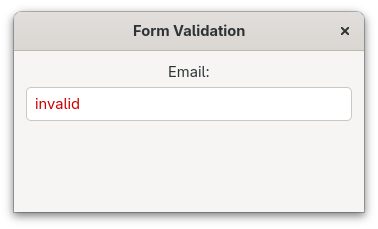
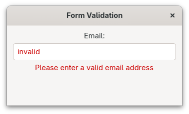
However, people who are color-blind or are using a screen reader won’t notice the red font. What we will therefore do instead is to combine color with a visible error message and an accessible state:
Filename: listings/accessibility/6/main.rs
use gtk::prelude::*;
use gtk::{
    AccessibleInvalidState, Application, ApplicationWindow, Entry, Label, Orientation,
    accessible, glib,
};

const APP_ID: &str = "org.gtk_rs.Accessibility6";

fn main() -> glib::ExitCode {
    let app = Application::builder().application_id(APP_ID).build();
    app.connect_activate(build_ui);
    app.run()
}

fn is_valid_email(text: &str) -> bool {
    text.contains('@') && text.contains('.')
}

fn build_ui(app: &Application) {
    let container = gtk::Box::builder()
        .orientation(Orientation::Vertical)
        .spacing(6)
        .margin_start(12)
        .margin_end(12)
        .margin_top(12)
        .margin_bottom(12)
        .build();

    let label = Label::new(Some("Email:"));
    let entry = Entry::new();
    entry.update_relation(&[accessible::Relation::LabelledBy(&[label.upcast_ref()])]);

    let error_label = Label::builder()
        .label("Please enter a valid email address")
        .css_classes(["error"])
        .visible(false)
        .build();

    // Correct: color, text and accessible state indicate the error
    entry.connect_changed({
        let error_label = error_label.clone();
        move |entry| {
            let text = entry.text();
            if !text.is_empty() && !is_valid_email(&text) {
                entry.add_css_class("error");
                error_label.set_visible(true);
                entry.update_state(&[accessible::State::Invalid(
                    AccessibleInvalidState::True,
                )]);
            } else {
                entry.remove_css_class("error");
                error_label.set_visible(false);
                entry.update_state(&[accessible::State::Invalid(
                    AccessibleInvalidState::False,
                )]);
            }
        }
    });

    container.append(&label);
    container.append(&entry);
    container.append(&error_label);

    let window = ApplicationWindow::builder()
        .application(app)
        .title("Form Validation")
        .default_width(350)
        .default_height(200)
        .child(&container)
        .build();

    window.present();
}
This way, the error is communicated through three channels:
- red color,
- text of an error label,
- and the
Invalidstate which will be announced by screen readers.
Testing Accessibility
Testing is essential for ensuring your application works well with assistive technologies.
Orca Screen Reader
On Linux you can use Orca which is pre-installed on many linux distributions. On GNOME can enable it in Settings → Accessibility → Screen Reader, or toggle it with Super+Alt+S (Super is typically the Windows key). Try navigating your application using only the keyboard while Orca announces elements. If the screen reader isn’t announcing the correct thing, it is time to adapt your application.
Accessibility Checklist
Here are some things you can look out for:
- The application needs to be fully usable with keyboard only
- Focus should be visible and move in a logical order
- Color must not be the only way to convey information
- All interactive elements and icon-only buttons need to have accessible labels
- Custom widgets need to have appropriate roles
- Dynamic state changes need to be reflected in accessible states
Conclusion
Hopefully, this gave you a good overview over what it means to create an application that is accessible to everyone. Of course that only scratched the surface of this topic. For a more information, I can recommend the following resources.