CSS
When you want to modify the style of your website, you use CSS. Similarly, GTK supports its own variant of CSS in order to style your app.
We will not explain every piece of syntax used in this chapter. If you are new to CSS or just need a refresher, have a look at the MDN Web Docs.
Let’s say we have a button and we want to set its font color to magenta.
Every type of widget has a corresponding CSS node.
In the case of gtk::Button, this node is called button.
Therefore, we create a style.css file with the following content:
Filename: listings/css/1/style.css
button {
  color: magenta;
}
Next, we need to load the CSS file in the startup step of the application. As usual, the widgets are created during the “activate” step.
Filename: listings/css/1/main.rs
use gdk::Display;
use gtk::prelude::*;
use gtk::{Application, ApplicationWindow, Button, CssProvider, gdk, glib};
const APP_ID: &str = "org.gtk_rs.Css1";
fn main() -> glib::ExitCode {
// Create a new application
let app = Application::builder().application_id(APP_ID).build();
// Connect to signals
app.connect_startup(|_| load_css());
app.connect_activate(build_ui);
// Run the application
app.run()
}
fn load_css() {
// Load the CSS file and add it to the provider
let provider = CssProvider::new();
provider.load_from_string(include_str!("style.css"));
// Add the provider to the default screen
gtk::style_context_add_provider_for_display(
&Display::default().expect("Could not connect to a display."),
&provider,
gtk::STYLE_PROVIDER_PRIORITY_APPLICATION,
);
}
fn build_ui(app: &Application) {
// Create button
let button = Button::builder()
.label("Press me!")
.margin_top(12)
.margin_bottom(12)
.margin_start(12)
.margin_end(12)
.build();
// Create a new window and present it
let window = ApplicationWindow::builder()
.application(app)
.title("My GTK App")
.child(&button)
.build();
window.present();
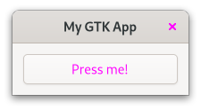
}When we now run the app, we notice that our button and the “close” button are magenta. Probably not what we wanted, but that is what our CSS snippet does. We did not specify for which button the rule should apply, so it was applied to both of them.
The
GtkInspectorcomes in quite handy (not only) when playing with CSS. Make sure that the window of your app is focused and press Ctrl + Shift + D. A window will pop up which lets you browse and even manipulate the state of your app. Open the CSS view and override the button color with the following snippet.button { color: blue; }With the pause button you can toggle whether your CSS code is active or not.
Style Classes Applied by GTK
Class selectors are one way to choose which specific elements a CSS rule applies to.
GTK adds style classes to many of its widgets, often depending on their content.
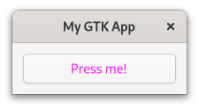
A gtk::Button, for example, will get the text-button style class when its content is a label.
That is why we create a new CSS rule which only applies to button nodes with the style class text_button.
Filename: listings/css/2/style.css
button.text-button {
  color: magenta;
}
Now only the font of our button becomes magenta.
Adding Your Own Style Class
With add_css_class we can also add our own style classes to widgets.
One use-case for this is when you want a rule to apply to a hand-picked set of widgets.
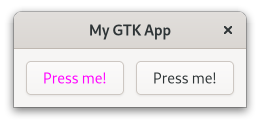
For example if we have two buttons, but want only one of them to have magenta font.
Relying on one of the style classes which GTK adds will not help since both will get the same ones.
Which is why we add the style class button-1 to the first one.
Filename: listings/css/3/main.rs
use gdk::Display;
use gtk::prelude::*;
use gtk::{Application, ApplicationWindow, Button, CssProvider, gdk, glib};
const APP_ID: &str = "org.gtk_rs.Css3";
fn main() -> glib::ExitCode {
// Create a new application
let app = Application::builder().application_id(APP_ID).build();
// Connect to signals
app.connect_startup(|_| load_css());
app.connect_activate(build_ui);
// Run the application
app.run()
}
fn load_css() {
// Load the CSS file and add it to the provider
let provider = CssProvider::new();
provider.load_from_string(include_str!("style.css"));
// Add the provider to the default screen
gtk::style_context_add_provider_for_display(
&Display::default().expect("Could not connect to a display."),
&provider,
gtk::STYLE_PROVIDER_PRIORITY_APPLICATION,
);
}
fn build_ui(app: &Application) {
// Create buttons
let button_1 = Button::with_label("Press me!");
let button_2 = Button::with_label("Press me!");
button_1.add_css_class("button-1");
// Create `gtk_box` and add buttons
let gtk_box = gtk::Box::builder()
.margin_top(12)
.margin_bottom(12)
.margin_start(12)
.margin_end(12)
.spacing(12)
.build();
gtk_box.append(&button_1);
gtk_box.append(&button_2);
// Create a new window and present it
let window = ApplicationWindow::builder()
.application(app)
.title("My GTK App")
.child(>k_box)
.build();
window.present();
}Then, we create a CSS rule that applies to button nodes with the style class button-1.
Filename: listings/css/3/style.css
button.button-1 {
  color: magenta;
}
We can see that this way only the first button gets colored magenta.
Specifying Name of a Widget
If you want that your rule only applies to a single widget, matching with style classes can be fine. Ideally however, you would give the widget a name and match with that name instead. This way your intentions are more clear, compared to matching with style classes that can apply to multiple widgets.
Again, we have two buttons but want to color only one of them magenta.
We set the name of the first one with set_widget_name.
Filename: listings/css/4/main.rs
use gdk::Display;
use gtk::prelude::*;
use gtk::{Application, ApplicationWindow, Button, CssProvider, gdk, glib};
const APP_ID: &str = "org.gtk_rs.Css4";
fn main() -> glib::ExitCode {
// Create a new application
let app = Application::builder().application_id(APP_ID).build();
// Connect to signals
app.connect_startup(|_| load_css());
app.connect_activate(build_ui);
// Run the application
app.run()
}
fn load_css() {
// Load the CSS file and add it to the provider
let provider = CssProvider::new();
provider.load_from_string(include_str!("style.css"));
// Add the provider to the default screen
gtk::style_context_add_provider_for_display(
&Display::default().expect("Could not connect to a display."),
&provider,
gtk::STYLE_PROVIDER_PRIORITY_APPLICATION,
);
}
fn build_ui(app: &Application) {
// Create buttons
let button_1 = Button::with_label("Press me!");
let button_2 = Button::with_label("Press me!");
button_1.set_widget_name("button-1");
// Create `gtk_box` and add buttons
let gtk_box = gtk::Box::builder()
.margin_top(12)
.margin_bottom(12)
.margin_start(12)
.margin_end(12)
.spacing(12)
.build();
gtk_box.append(&button_1);
gtk_box.append(&button_2);
// Create a new window and present it
let window = ApplicationWindow::builder()
.application(app)
.title("My GTK App")
.child(>k_box)
.build();
window.present();
}Then, create a CSS rule that applies to button nodes with the name button-1.
The name is specified after the # symbol.
Filename: listings/css/4/style.css
button#button-1 {
  color: magenta;
}
Again, the style rule only applies to the first button.

CSS Rules Provided by GTK
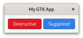
Certain styles are common enough that GTK provides CSS rules for them. For example, if you want to indicate that your button leads to a destructive or suggested action you don’t have to provide your own CSS rules. All you have to do is to add “destructive-action” or “suggested-action” style class to your button. Most widgets will document these rules in their documentation under CSS nodes.
Filename: listings/css/5/main.rs
use gtk::glib;
use gtk::prelude::*;
use gtk::{Application, ApplicationWindow, Button};
const APP_ID: &str = "org.gtk_rs.Css5";
fn main() -> glib::ExitCode {
// Create a new application
let app = Application::builder().application_id(APP_ID).build();
// Connect to signals
app.connect_activate(build_ui);
// Run the application
app.run()
}
fn build_ui(app: &Application) {
// Create buttons
let button_1 = Button::with_label("Destructive");
let button_2 = Button::with_label("Suggested");
button_1.add_css_class("destructive-action");
button_2.add_css_class("suggested-action");
// Create `gtk_box` and add buttons
let gtk_box = gtk::Box::builder()
.margin_top(12)
.margin_bottom(12)
.margin_start(12)
.margin_end(12)
.spacing(6)
.build();
gtk_box.append(&button_1);
gtk_box.append(&button_2);
// Create a new window and present it
let window = ApplicationWindow::builder()
.application(app)
.title("My GTK App")
.child(>k_box)
.build();
window.present();
}
Interface Builder
We can also add style classes with the interface builder.
Just add the <style> element to your widget.
The <style> element is documented together with gtk::Widget.
Adding again destructive and suggested buttons, would then look like this:
Filename: listings/css/6/window/window.ui
<?xml version="1.0" encoding="UTF-8"?>
<interface>
  <template class="MyGtkAppWindow" parent="GtkApplicationWindow">
    <property name="title" translatable="yes">My GTK App</property>
    <child>
      <object class="GtkBox">
        <property name="margin-top">12</property>
        <property name="margin-bottom">12</property>
        <property name="margin-start">12</property>
        <property name="margin-end">12</property>
        <property name="spacing">6</property>
        <child>
          <object class="GtkButton">
            <property name="label">Destructive</property>
            <style>
              <class name="destructive-action"/>
            </style>
          </object>
        </child>
        <child>
          <object class="GtkButton">
            <property name="label">Suggested</property>
            <style>
              <class name="suggested-action"/>
            </style>
          </object>
        </child>
      </object>
    </child>
  </template>
</interface>
Pseudo-classes
Sometimes you want your CSS rules to apply under even more precise conditions than style classes allow.
That is where pseudo-classes come in.
Let’s use a single button with name button-1 to demonstrate this concept.
Filename: listings/css/7/window/window.ui
<?xml version="1.0" encoding="UTF-8"?>
<interface>
  <template class="MyGtkAppWindow" parent="GtkApplicationWindow">
    <property name="title" translatable="yes">My GTK App</property>
    <child>
      <object class="GtkButton">
        <property name="label">Hover over me!</property>
        <property name="margin-top">12</property>
        <property name="margin-bottom">12</property>
        <property name="margin-start">12</property>
        <property name="margin-end">12</property>
        <property name="name">button-1</property>
      </object>
    </child>
  </template>
</interface>
By adding the pseudo-class hover, we say that we want this rule to only apply to a button node with name button-1 when hovering over it with the mouse pointer.
Filename: listings/css/7/style.css
button#button-1:hover {
  color: magenta;
  background: yellow;
}
If we now hover over the button, we see that over the span of one second its background turns yellow and its font turns magenta. After we removed the cursor, the button returns to its original state.
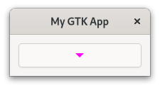
Nodes
In the previous examples, a widget always corresponded to a single CSS node.
This is not always the case.
For example, gtk::MenuButton has multiple CSS nodes.
Let’s see how that works.
First, we create a single MenuButton.
Filename: listings/css/8/window/window.ui
<?xml version="1.0" encoding="UTF-8"?>
<interface>
  <template class="MyGtkAppWindow" parent="GtkApplicationWindow">
    <property name="title" translatable="yes">My GTK App</property>
    <child>
      <object class="GtkMenuButton">
        <property name="margin-top">12</property>
        <property name="margin-bottom">12</property>
        <property name="margin-start">12</property>
        <property name="margin-end">12</property>
      </object>
    </child>
  </template>
</interface>
You can make a MenuButton show an icon or a label.
If you choose to do neither of those, as we currently do, it shows an image displaying an arrow.
An inheritance tree of CSS nodes displays this situation:
menubutton
╰── button.toggle
    ╰── <content>
         ╰── [arrow]
We see that the menubutton node has children, which themselves have children and attached style classes.
Now we know that we have to add a CSS rule that applies to the arrow node, which is a descendant of menubutton.
Filename: listings/css/8/style.css
menubutton arrow {
  color: magenta;
}
Indeed, we get a MenuButton with a magenta arrow.
Set CSS Name and Use Exported Colors
We already learned how to give an instance of a widget a name with pseudo-classes. But what if we have a custom widget and we want to reference all instances of it? Let’s see how to deal with this situation by messing with our To-Do app once more.
The class TaskRow inherits from gtk::Box, so we could just match for the node box.
However, in that case we would also match with other instance of gtk::Box.
What we will want to do instead is to give TaskRow its own CSS name.
When calling set_css_name , we change the name of the CSS node of the widget class.
In our case, the widget TaskRow then corresponds to the node task-row.
Filename: listings/todo/3/task_row/imp.rs
use std::cell::RefCell;

use glib::Binding;
use gtk::subclass::prelude::*;
use gtk::{CheckButton, CompositeTemplate, Label, glib};

// Object holding the state
#[derive(Default, CompositeTemplate)]
#[template(resource = "/org/gtk_rs/Todo3/task_row.ui")]
pub struct TaskRow {
    #[template_child]
    pub completed_button: TemplateChild<CheckButton>,
    #[template_child]
    pub content_label: TemplateChild<Label>,
    // Vector holding the bindings to properties of `TaskObject`
    pub bindings: RefCell<Vec<Binding>>,
}

// The central trait for subclassing a GObject
#[glib::object_subclass]
impl ObjectSubclass for TaskRow {
    // `NAME` needs to match `class` attribute of template
    const NAME: &'static str = "TodoTaskRow";
    type Type = super::TaskRow;
    type ParentType = gtk::Box;

    fn class_init(klass: &mut Self::Class) {
        klass.bind_template();
        klass.set_css_name("task-row");
    }

    fn instance_init(obj: &glib::subclass::InitializingObject<Self>) {
        obj.init_template();
    }
}

// Trait shared by all GObjects
impl ObjectImpl for TaskRow {}

// Trait shared by all widgets
impl WidgetImpl for TaskRow {}

// Trait shared by all boxes
impl BoxImpl for TaskRow {}
What to do with the new node name now?
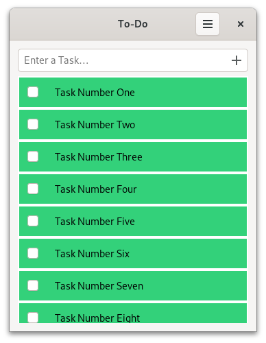
Let’s change the background color once more but this time with a twist.
We are going to use the named color success_color.
Filename: listings/todo/3/resources/style.css
task-row {
  background-color: @success_color;
}
The Default stylesheet of GTK provides pre-defined colors for various use-cases.
As of this writing, these exported colors can only be found in its source code.
There we find the color success_color, which in real scenarios should be used to indicate success.
We can then access the pre-defined color by adding an @ in front of its name.
We also have to add style.css to resources.gresource.xml.
Filename: listings/todo/3/resources/resources.gresource.xml
 <?xml version="1.0" encoding="UTF-8"?>
 <gresources>
   <gresource prefix="/org/gtk_rs/Todo3/">
     <file compressed="true" preprocess="xml-stripblanks" alias="gtk/help-overlay.ui">shortcuts.ui</file>
     <file compressed="true" preprocess="xml-stripblanks">task_row.ui</file>
     <file compressed="true" preprocess="xml-stripblanks">window.ui</file>
+    <file compressed="true">style.css</file>
   </gresource>
 </gresources>
Additionally, we call load_css() in connect_startup.
Filename: listings/todo/3/main.rs
mod task_object;
mod task_row;
mod utils;
mod window;

use gdk::Display;
use gtk::prelude::*;
use gtk::{Application, CssProvider, gdk, gio, glib};
use window::Window;

const APP_ID: &str = "org.gtk_rs.Todo3";

fn main() -> glib::ExitCode {
    gio::resources_register_include!("todo_3.gresource")
        .expect("Failed to register resources.");

    // Create a new application
    let app = Application::builder().application_id(APP_ID).build();

    // Connect to signals
    app.connect_startup(|app| {
        setup_shortcuts(app);
        load_css()
    });
    app.connect_activate(build_ui);

    // Run the application
    app.run()
}

fn setup_shortcuts(app: &Application) {
    app.set_accels_for_action("win.filter('All')", &["<Ctrl>a"]);
    app.set_accels_for_action("win.filter('Open')", &["<Ctrl>o"]);
    app.set_accels_for_action("win.filter('Done')", &["<Ctrl>d"]);
}

fn load_css() {
    // Load the CSS file and add it to the provider
    let provider = CssProvider::new();
    provider.load_from_resource("/org/gtk_rs/Todo3/style.css");

    // Add the provider to the default screen
    gtk::style_context_add_provider_for_display(
        &Display::default().expect("Could not connect to a display."),
        &provider,
        gtk::STYLE_PROVIDER_PRIORITY_APPLICATION,
    );
}

fn build_ui(app: &Application) {
    // Create a new custom window and present it
    let window = Window::new(app);
    window.present();
}
load_css() is very similar to the one shown at the beginning of the chapter.
However, this time we load styles using load_from_resource().
mod task_object;
mod task_row;
mod utils;
mod window;

use gdk::Display;
use gtk::prelude::*;
use gtk::{Application, CssProvider, gdk, gio, glib};
use window::Window;

const APP_ID: &str = "org.gtk_rs.Todo3";

fn main() -> glib::ExitCode {
    gio::resources_register_include!("todo_3.gresource")
        .expect("Failed to register resources.");

    // Create a new application
    let app = Application::builder().application_id(APP_ID).build();

    // Connect to signals
    app.connect_startup(|app| {
        setup_shortcuts(app);
        load_css()
    });
    app.connect_activate(build_ui);

    // Run the application
    app.run()
}

fn setup_shortcuts(app: &Application) {
    app.set_accels_for_action("win.filter('All')", &["<Ctrl>a"]);
    app.set_accels_for_action("win.filter('Open')", &["<Ctrl>o"]);
    app.set_accels_for_action("win.filter('Done')", &["<Ctrl>d"]);
}

fn load_css() {
    // Load the CSS file and add it to the provider
    let provider = CssProvider::new();
    provider.load_from_resource("/org/gtk_rs/Todo3/style.css");

    // Add the provider to the default screen
    gtk::style_context_add_provider_for_display(
        &Display::default().expect("Could not connect to a display."),
        &provider,
        gtk::STYLE_PROVIDER_PRIORITY_APPLICATION,
    );
}

fn build_ui(app: &Application) {
    // Create a new custom window and present it
    let window = Window::new(app);
    window.present();
}
And that is how the task rows look like after the change. Probably better to revert this immediately again.
Adapt Todo App
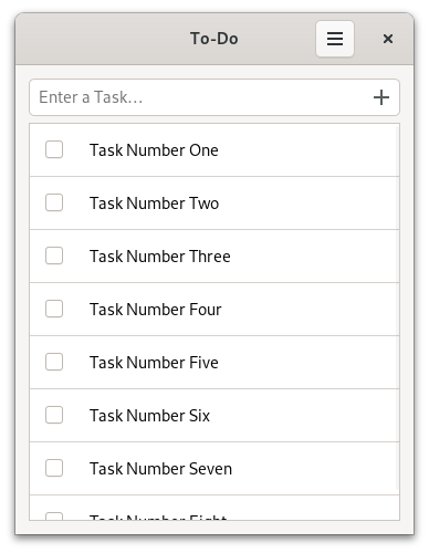
Luckily, finding an actual use for CSS in our To-Do app isn’t too hard.
Until now the different tasks weren’t nicely separated.
We can change that by adding the frame and the separators style class to our tasks_list.
Filename: listings/todo/4/resources/window.ui
 <object class="GtkListView" id="tasks_list">
   <property name="valign">start</property>
+  <style>
+    <class name="frame"/>
+    <class name="separators"/>
+  </style>
 </object>
Conclusion
There are surely enough ways to define CSS rules.
Let’s briefly recap the syntax we learned.
The following rule matches the node arrow, which is a descendant of the node button with the name button-1 and the style classes toggle and text-button.
The rule then actually applies, when we also hover over arrow.
button#button-1.toggle.text-button arrow:hover {
  color: magenta;
}
When the rule applies, the color parameter will be set to magenta.
You can find the full list of supported parameters in GTK’s documentation.