Struct gtk4::MenuButton
source · #[repr(transparent)]pub struct MenuButton { /* private fields */ }Expand description
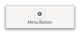
The MenuButton widget is used to display a popup when clicked.
This popup can be provided either as a Popover or as an abstract
GMenuModel.
The MenuButton widget can show either an icon (set with the
property::MenuButton::icon-name property) or a label (set with the
property::MenuButton::label property). If neither is explicitly set,
a Image is automatically created, using an arrow image oriented
according to property::MenuButton::direction or the generic
“open-menu-symbolic” icon if the direction is not set.
The positioning of the popup is determined by the
property::MenuButton::direction property of the menu button.
For menus, the property::Widget::halign and property::Widget::valign
properties of the menu are also taken into account. For example, when the
direction is ArrowType::Down and the horizontal alignment is Align::Start,
the menu will be positioned below the button, with the starting edge
(depending on the text direction) of the menu aligned with the starting
edge of the button. If there is not enough space below the button, the
menu is popped up above the button instead. If the alignment would move
part of the menu offscreen, it is “pushed in”.
| start | center | end | |
|---|---|---|---|
| down | 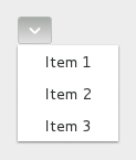 | 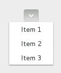 | 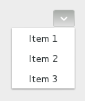 |
| up | 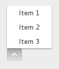 | 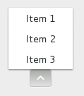 | 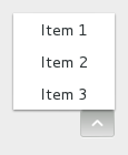 |
| left | 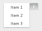 | 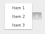 | 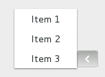 |
| right | 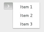 | 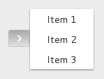 | 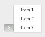 |
CSS nodes
menubutton
╰── button.toggle
    ╰── <content>
         ╰── [arrow]
MenuButton has a single CSS node with name menubutton
which contains a button node with a .toggle style class.
If the button contains an icon, it will have the .image-button style class,
if it contains text, it will have .text-button style class. If an arrow is
visible in addition to an icon, text or a custom child, it will also have
.arrow-button style class.
Inside the toggle button content, there is an arrow node for
the indicator, which will carry one of the .none, .up, .down,
.left or .right style classes to indicate the direction that
the menu will appear in. The CSS is expected to provide a suitable
image for each of these cases using the -gtk-icon-source property.
Optionally, the menubutton node can carry the .circular style class
to request a round appearance.
Accessibility
MenuButton uses the AccessibleRole::Button role.
Implements
WidgetExt, glib::ObjectExt, AccessibleExt, BuildableExt, ConstraintTargetExt, WidgetExtManual, AccessibleExtManual
Implementations§
source§impl MenuButton
impl MenuButton
sourcepub fn new() -> MenuButton
pub fn new() -> MenuButton
Creates a new MenuButton widget with downwards-pointing
arrow as the only child.
You can replace the child widget with another Widget
should you wish to.
Returns
The newly created MenuButton
sourcepub fn builder() -> MenuButtonBuilder
pub fn builder() -> MenuButtonBuilder
Creates a new builder-pattern struct instance to construct MenuButton objects.
This method returns an instance of MenuButtonBuilder which can be used to create MenuButton objects.
sourcepub fn must_always_show_arrow(&self) -> bool
Available on crate feature v4_4 only.
pub fn must_always_show_arrow(&self) -> bool
v4_4 only.Gets whether to show a dropdown arrow even when using an icon.
Returns
whether to show a dropdown arrow even when using an icon
sourcepub fn is_primary(&self) -> bool
Available on crate feature v4_4 only.
pub fn is_primary(&self) -> bool
v4_4 only.sourcepub fn uses_underline(&self) -> bool
pub fn uses_underline(&self) -> bool
sourcepub fn set_always_show_arrow(&self, always_show_arrow: bool)
Available on crate feature v4_4 only.
pub fn set_always_show_arrow(&self, always_show_arrow: bool)
v4_4 only.Sets whether to show a dropdown arrow even when using an icon or a custom child.
always_show_arrow
whether to show a dropdown arrow even when using an icon
sourcepub fn set_child(&self, child: Option<&impl IsA<Widget>>)
Available on crate feature v4_6 only.
pub fn set_child(&self, child: Option<&impl IsA<Widget>>)
v4_6 only.Sets the child widget of @self.
Setting a child resets property::MenuButton::label and
property::MenuButton::icon-name.
If property::MenuButton::always-show-arrow is set to TRUE and
property::MenuButton::direction is not GTK_ARROW_NONE, a dropdown arrow
will be shown next to the child.
child
the child widget
sourcepub fn set_create_popup_func<P: Fn(&MenuButton) + 'static>(&self, func: P)
pub fn set_create_popup_func<P: Fn(&MenuButton) + 'static>(&self, func: P)
Sets @func to be called when a popup is about to be shown.
@func should use one of
to set a popup for @self.
If @func is non-None, @self will always be sensitive.
Using this function will not reset the menu widget attached to @self. Instead, this can be done manually in @func.
func
function to call when a popup is about to
be shown, but none has been provided via other means, or None
to reset to default behavior.
destroy_notify
destroy notify for @user_data
sourcepub fn set_direction(&self, direction: ArrowType)
pub fn set_direction(&self, direction: ArrowType)
Sets the direction in which the popup will be popped up.
If the button is automatically populated with an arrow icon, its direction will be changed to match.
If the does not fit in the available space in the given direction, GTK will its best to keep it inside the screen and fully visible.
If you pass ArrowType::None for a @direction, the popup will behave
as if you passed ArrowType::Down (although you won’t see any arrows).
direction
sourcepub fn set_has_frame(&self, has_frame: bool)
pub fn set_has_frame(&self, has_frame: bool)
sourcepub fn set_icon_name(&self, icon_name: &str)
pub fn set_icon_name(&self, icon_name: &str)
Sets the name of an icon to show inside the menu button.
Setting icon name resets property::MenuButton::label and
property::MenuButton::child.
If property::MenuButton::always-show-arrow is set to TRUE and
property::MenuButton::direction is not GTK_ARROW_NONE, a dropdown arrow
will be shown next to the icon.
icon_name
the icon name
sourcepub fn set_label(&self, label: &str)
pub fn set_label(&self, label: &str)
Sets the label to show inside the menu button.
Setting a label resets property::MenuButton::icon-name and
property::MenuButton::child.
If property::MenuButton::direction is not GTK_ARROW_NONE, a dropdown
arrow will be shown next to the label.
label
the label
Sets the GMenuModel from which the popup will be constructed.
If @menu_model is None, the button is disabled.
A Popover will be created from the menu model with
PopoverMenu::from_model(). Actions will be connected
as documented for this function.
If property::MenuButton::popover is already set, it will be
dissociated from the @self, and the property is set to None.
menu_model
a GMenuModel, or None to unset and disable the
button
sourcepub fn set_popover(&self, popover: Option<&impl IsA<Widget>>)
pub fn set_popover(&self, popover: Option<&impl IsA<Widget>>)
sourcepub fn set_primary(&self, primary: bool)
Available on crate feature v4_4 only.
pub fn set_primary(&self, primary: bool)
v4_4 only.Sets whether menu button acts as a primary menu.
Primary menus can be opened with the F10 key.
primary
whether the menubutton should act as a primary menu
sourcepub fn set_use_underline(&self, use_underline: bool)
pub fn set_use_underline(&self, use_underline: bool)
If true, an underline in the text indicates a mnemonic.
use_underline
true if underlines in the text indicate mnemonics
sourcepub fn connect_activate<F: Fn(&Self) + 'static>(&self, f: F) -> SignalHandlerId
Available on crate feature v4_4 only.
pub fn connect_activate<F: Fn(&Self) + 'static>(&self, f: F) -> SignalHandlerId
v4_4 only.Emitted to when the menu button is activated.
The ::activate signal on MenuButton is an action signal and
emitting it causes the button to pop up its menu.
pub fn emit_activate(&self)
v4_4 only.pub fn connect_always_show_arrow_notify<F: Fn(&Self) + 'static>(
&self,
f: F
) -> SignalHandlerId
v4_4 only.pub fn connect_child_notify<F: Fn(&Self) + 'static>(
&self,
f: F
) -> SignalHandlerId
v4_6 only.pub fn connect_direction_notify<F: Fn(&Self) + 'static>(
&self,
f: F
) -> SignalHandlerId
pub fn connect_has_frame_notify<F: Fn(&Self) + 'static>(
&self,
f: F
) -> SignalHandlerId
pub fn connect_icon_name_notify<F: Fn(&Self) + 'static>(
&self,
f: F
) -> SignalHandlerId
pub fn connect_label_notify<F: Fn(&Self) + 'static>(
&self,
f: F
) -> SignalHandlerId
pub fn connect_popover_notify<F: Fn(&Self) + 'static>(
&self,
f: F
) -> SignalHandlerId
pub fn connect_primary_notify<F: Fn(&Self) + 'static>(
&self,
f: F
) -> SignalHandlerId
v4_4 only.pub fn connect_use_underline_notify<F: Fn(&Self) + 'static>(
&self,
f: F
) -> SignalHandlerId
source§impl MenuButton
impl MenuButton
pub fn unset_create_popup_func(&self)
Trait Implementations§
source§impl Clone for MenuButton
impl Clone for MenuButton
source§impl Debug for MenuButton
impl Debug for MenuButton
source§impl Default for MenuButton
impl Default for MenuButton
source§impl Display for MenuButton
impl Display for MenuButton
source§impl Hash for MenuButton
impl Hash for MenuButton
source§impl Ord for MenuButton
impl Ord for MenuButton
source§impl ParentClassIs for MenuButton
impl ParentClassIs for MenuButton
source§impl<OT: ObjectType> PartialEq<OT> for MenuButton
impl<OT: ObjectType> PartialEq<OT> for MenuButton
source§impl<OT: ObjectType> PartialOrd<OT> for MenuButton
impl<OT: ObjectType> PartialOrd<OT> for MenuButton
1.0.0 · source§fn le(&self, other: &Rhs) -> bool
fn le(&self, other: &Rhs) -> bool
self and other) and is used by the <=
operator. Read moresource§impl StaticType for MenuButton
impl StaticType for MenuButton
source§fn static_type() -> Type
fn static_type() -> Type
Self.impl Eq for MenuButton
impl IsA<Accessible> for MenuButton
impl IsA<Buildable> for MenuButton
impl IsA<ConstraintTarget> for MenuButton
impl IsA<Widget> for MenuButton
Auto Trait Implementations§
impl RefUnwindSafe for MenuButton
impl !Send for MenuButton
impl !Sync for MenuButton
impl Unpin for MenuButton
impl UnwindSafe for MenuButton
Blanket Implementations§
source§impl<O> AccessibleExtManual for Owhere
O: IsA<Accessible>,
impl<O> AccessibleExtManual for Owhere
O: IsA<Accessible>,
source§fn update_property(&self, properties: &[Property<'_>])
fn update_property(&self, properties: &[Property<'_>])
source§fn update_relation(&self, relations: &[Relation<'_>])
fn update_relation(&self, relations: &[Relation<'_>])
source§fn update_state(&self, states: &[State])
fn update_state(&self, states: &[State])
source§impl<T> Cast for Twhere
T: ObjectType,
impl<T> Cast for Twhere
T: ObjectType,
source§fn upcast<T>(self) -> Twhere
T: ObjectType,
Self: IsA<T>,
fn upcast<T>(self) -> Twhere
T: ObjectType,
Self: IsA<T>,
T. Read moresource§fn upcast_ref<T>(&self) -> &Twhere
T: ObjectType,
Self: IsA<T>,
fn upcast_ref<T>(&self) -> &Twhere
T: ObjectType,
Self: IsA<T>,
T. Read moresource§fn downcast<T>(self) -> Result<T, Self>where
T: ObjectType,
Self: CanDowncast<T>,
fn downcast<T>(self) -> Result<T, Self>where
T: ObjectType,
Self: CanDowncast<T>,
T. Read moresource§fn downcast_ref<T>(&self) -> Option<&T>where
T: ObjectType,
Self: CanDowncast<T>,
fn downcast_ref<T>(&self) -> Option<&T>where
T: ObjectType,
Self: CanDowncast<T>,
T. Read moresource§fn dynamic_cast<T>(self) -> Result<T, Self>where
T: ObjectType,
fn dynamic_cast<T>(self) -> Result<T, Self>where
T: ObjectType,
T. This handles upcasting, downcasting
and casting between interface and interface implementors. All checks are performed at
runtime, while downcast and upcast will do many checks at compile-time already. Read moresource§fn dynamic_cast_ref<T>(&self) -> Option<&T>where
T: ObjectType,
fn dynamic_cast_ref<T>(&self) -> Option<&T>where
T: ObjectType,
T. This handles upcasting, downcasting
and casting between interface and interface implementors. All checks are performed at
runtime, while downcast and upcast will do many checks at compile-time already. Read moresource§unsafe fn unsafe_cast<T>(self) -> Twhere
T: ObjectType,
unsafe fn unsafe_cast<T>(self) -> Twhere
T: ObjectType,
T unconditionally. Read moresource§unsafe fn unsafe_cast_ref<T>(&self) -> &Twhere
T: ObjectType,
unsafe fn unsafe_cast_ref<T>(&self) -> &Twhere
T: ObjectType,
&T unconditionally. Read moresource§impl<U> IsSubclassableExt for Uwhere
U: IsClass + ParentClassIs,
impl<U> IsSubclassableExt for Uwhere
U: IsClass + ParentClassIs,
fn parent_class_init<T>(class: &mut Class<U>)where
T: ObjectSubclass,
<U as ParentClassIs>::Parent: IsSubclassable<T>,
fn parent_instance_init<T>(instance: &mut InitializingObject<T>)where
T: ObjectSubclass,
<U as ParentClassIs>::Parent: IsSubclassable<T>,
source§impl<T> ObjectExt for Twhere
T: ObjectType,
impl<T> ObjectExt for Twhere
T: ObjectType,
source§fn is<U>(&self) -> boolwhere
U: StaticType,
fn is<U>(&self) -> boolwhere
U: StaticType,
true if the object is an instance of (can be cast to) T.source§fn object_class(&self) -> &Class<Object>
fn object_class(&self) -> &Class<Object>
ObjectClass of the object. Read moresource§fn class_of<U>(&self) -> Option<&Class<U>>where
U: IsClass,
fn class_of<U>(&self) -> Option<&Class<U>>where
U: IsClass,
T. Read moresource§fn interface<U>(&self) -> Option<InterfaceRef<'_, U>>where
U: IsInterface,
fn interface<U>(&self) -> Option<InterfaceRef<'_, U>>where
U: IsInterface,
T of the object. Read moresource§fn set_property<V>(&self, property_name: &str, value: V)where
V: ToValue,
fn set_property<V>(&self, property_name: &str, value: V)where
V: ToValue,
source§fn set_property_from_value(&self, property_name: &str, value: &Value)
fn set_property_from_value(&self, property_name: &str, value: &Value)
source§fn set_properties(&self, property_values: &[(&str, &dyn ToValue)])
fn set_properties(&self, property_values: &[(&str, &dyn ToValue)])
source§fn set_properties_from_value(&self, property_values: &[(&str, Value)])
fn set_properties_from_value(&self, property_values: &[(&str, Value)])
source§fn property<V>(&self, property_name: &str) -> Vwhere
V: 'static + for<'b> FromValue<'b>,
fn property<V>(&self, property_name: &str) -> Vwhere
V: 'static + for<'b> FromValue<'b>,
property_name of the object and cast it to the type V. Read moresource§fn property_value(&self, property_name: &str) -> Value
fn property_value(&self, property_name: &str) -> Value
property_name of the object. Read moresource§fn property_type(&self, property_name: &str) -> Option<Type>
fn property_type(&self, property_name: &str) -> Option<Type>
property_name of this object. Read moresource§fn find_property(&self, property_name: &str) -> Option<ParamSpec>
fn find_property(&self, property_name: &str) -> Option<ParamSpec>
ParamSpec of the property property_name of this object.source§fn list_properties(&self) -> PtrSlice<ParamSpec>
fn list_properties(&self) -> PtrSlice<ParamSpec>
ParamSpec of the properties of this object.source§fn freeze_notify(&self) -> PropertyNotificationFreezeGuard
fn freeze_notify(&self) -> PropertyNotificationFreezeGuard
source§unsafe fn set_qdata<QD>(&self, key: Quark, value: QD)where
QD: 'static,
unsafe fn set_qdata<QD>(&self, key: Quark, value: QD)where
QD: 'static,
key. Read moresource§unsafe fn qdata<QD>(&self, key: Quark) -> Option<NonNull<QD>>where
QD: 'static,
unsafe fn qdata<QD>(&self, key: Quark) -> Option<NonNull<QD>>where
QD: 'static,
key. Read moresource§unsafe fn steal_qdata<QD>(&self, key: Quark) -> Option<QD>where
QD: 'static,
unsafe fn steal_qdata<QD>(&self, key: Quark) -> Option<QD>where
QD: 'static,
key. Read moresource§unsafe fn set_data<QD>(&self, key: &str, value: QD)where
QD: 'static,
unsafe fn set_data<QD>(&self, key: &str, value: QD)where
QD: 'static,
key. Read moresource§unsafe fn data<QD>(&self, key: &str) -> Option<NonNull<QD>>where
QD: 'static,
unsafe fn data<QD>(&self, key: &str) -> Option<NonNull<QD>>where
QD: 'static,
key. Read moresource§unsafe fn steal_data<QD>(&self, key: &str) -> Option<QD>where
QD: 'static,
unsafe fn steal_data<QD>(&self, key: &str) -> Option<QD>where
QD: 'static,
key. Read moresource§fn block_signal(&self, handler_id: &SignalHandlerId)
fn block_signal(&self, handler_id: &SignalHandlerId)
source§fn unblock_signal(&self, handler_id: &SignalHandlerId)
fn unblock_signal(&self, handler_id: &SignalHandlerId)
source§fn stop_signal_emission(&self, signal_id: SignalId, detail: Option<Quark>)
fn stop_signal_emission(&self, signal_id: SignalId, detail: Option<Quark>)
source§fn stop_signal_emission_by_name(&self, signal_name: &str)
fn stop_signal_emission_by_name(&self, signal_name: &str)
source§fn connect<F>(
&self,
signal_name: &str,
after: bool,
callback: F
) -> SignalHandlerIdwhere
F: 'static + Fn(&[Value]) -> Option<Value> + Send + Sync,
fn connect<F>(
&self,
signal_name: &str,
after: bool,
callback: F
) -> SignalHandlerIdwhere
F: 'static + Fn(&[Value]) -> Option<Value> + Send + Sync,
signal_name on this object. Read moresource§fn connect_id<F>(
&self,
signal_id: SignalId,
details: Option<Quark>,
after: bool,
callback: F
) -> SignalHandlerIdwhere
F: 'static + Fn(&[Value]) -> Option<Value> + Send + Sync,
fn connect_id<F>(
&self,
signal_id: SignalId,
details: Option<Quark>,
after: bool,
callback: F
) -> SignalHandlerIdwhere
F: 'static + Fn(&[Value]) -> Option<Value> + Send + Sync,
signal_id on this object. Read moresource§fn connect_local<F>(
&self,
signal_name: &str,
after: bool,
callback: F
) -> SignalHandlerIdwhere
F: 'static + Fn(&[Value]) -> Option<Value>,
fn connect_local<F>(
&self,
signal_name: &str,
after: bool,
callback: F
) -> SignalHandlerIdwhere
F: 'static + Fn(&[Value]) -> Option<Value>,
signal_name on this object. Read moresource§fn connect_local_id<F>(
&self,
signal_id: SignalId,
details: Option<Quark>,
after: bool,
callback: F
) -> SignalHandlerIdwhere
F: 'static + Fn(&[Value]) -> Option<Value>,
fn connect_local_id<F>(
&self,
signal_id: SignalId,
details: Option<Quark>,
after: bool,
callback: F
) -> SignalHandlerIdwhere
F: 'static + Fn(&[Value]) -> Option<Value>,
signal_id on this object. Read moresource§unsafe fn connect_unsafe<F>(
&self,
signal_name: &str,
after: bool,
callback: F
) -> SignalHandlerIdwhere
F: Fn(&[Value]) -> Option<Value>,
unsafe fn connect_unsafe<F>(
&self,
signal_name: &str,
after: bool,
callback: F
) -> SignalHandlerIdwhere
F: Fn(&[Value]) -> Option<Value>,
signal_name on this object. Read moresource§unsafe fn connect_unsafe_id<F>(
&self,
signal_id: SignalId,
details: Option<Quark>,
after: bool,
callback: F
) -> SignalHandlerIdwhere
F: Fn(&[Value]) -> Option<Value>,
unsafe fn connect_unsafe_id<F>(
&self,
signal_id: SignalId,
details: Option<Quark>,
after: bool,
callback: F
) -> SignalHandlerIdwhere
F: Fn(&[Value]) -> Option<Value>,
signal_id on this object. Read moresource§fn connect_closure(
&self,
signal_name: &str,
after: bool,
closure: RustClosure
) -> SignalHandlerId
fn connect_closure(
&self,
signal_name: &str,
after: bool,
closure: RustClosure
) -> SignalHandlerId
signal_name on this object. Read moresource§fn connect_closure_id(
&self,
signal_id: SignalId,
details: Option<Quark>,
after: bool,
closure: RustClosure
) -> SignalHandlerId
fn connect_closure_id(
&self,
signal_id: SignalId,
details: Option<Quark>,
after: bool,
closure: RustClosure
) -> SignalHandlerId
signal_id on this object. Read moresource§fn watch_closure(&self, closure: &impl AsRef<Closure>)
fn watch_closure(&self, closure: &impl AsRef<Closure>)
closure to the lifetime of the object. When
the object’s reference count drops to zero, the closure will be
invalidated. An invalidated closure will ignore any calls to
invoke_with_values, or
invoke when using Rust closures.source§fn emit<R>(&self, signal_id: SignalId, args: &[&dyn ToValue]) -> Rwhere
R: TryFromClosureReturnValue,
fn emit<R>(&self, signal_id: SignalId, args: &[&dyn ToValue]) -> Rwhere
R: TryFromClosureReturnValue,
source§fn emit_with_values(&self, signal_id: SignalId, args: &[Value]) -> Option<Value>
fn emit_with_values(&self, signal_id: SignalId, args: &[Value]) -> Option<Value>
Self::emit but takes Value for the arguments.source§fn emit_by_name<R>(&self, signal_name: &str, args: &[&dyn ToValue]) -> Rwhere
R: TryFromClosureReturnValue,
fn emit_by_name<R>(&self, signal_name: &str, args: &[&dyn ToValue]) -> Rwhere
R: TryFromClosureReturnValue,
source§fn emit_by_name_with_values(
&self,
signal_name: &str,
args: &[Value]
) -> Option<Value>
fn emit_by_name_with_values(
&self,
signal_name: &str,
args: &[Value]
) -> Option<Value>
source§fn emit_by_name_with_details<R>(
&self,
signal_name: &str,
details: Quark,
args: &[&dyn ToValue]
) -> Rwhere
R: TryFromClosureReturnValue,
fn emit_by_name_with_details<R>(
&self,
signal_name: &str,
details: Quark,
args: &[&dyn ToValue]
) -> Rwhere
R: TryFromClosureReturnValue,
source§fn emit_by_name_with_details_and_values(
&self,
signal_name: &str,
details: Quark,
args: &[Value]
) -> Option<Value>
fn emit_by_name_with_details_and_values(
&self,
signal_name: &str,
details: Quark,
args: &[Value]
) -> Option<Value>
source§fn emit_with_details<R>(
&self,
signal_id: SignalId,
details: Quark,
args: &[&dyn ToValue]
) -> Rwhere
R: TryFromClosureReturnValue,
fn emit_with_details<R>(
&self,
signal_id: SignalId,
details: Quark,
args: &[&dyn ToValue]
) -> Rwhere
R: TryFromClosureReturnValue,
source§fn emit_with_details_and_values(
&self,
signal_id: SignalId,
details: Quark,
args: &[Value]
) -> Option<Value>
fn emit_with_details_and_values(
&self,
signal_id: SignalId,
details: Quark,
args: &[Value]
) -> Option<Value>
source§fn disconnect(&self, handler_id: SignalHandlerId)
fn disconnect(&self, handler_id: SignalHandlerId)
source§fn connect_notify<F>(&self, name: Option<&str>, f: F) -> SignalHandlerIdwhere
F: 'static + Fn(&T, &ParamSpec) + Send + Sync,
fn connect_notify<F>(&self, name: Option<&str>, f: F) -> SignalHandlerIdwhere
F: 'static + Fn(&T, &ParamSpec) + Send + Sync,
notify signal of the object. Read moresource§fn connect_notify_local<F>(&self, name: Option<&str>, f: F) -> SignalHandlerIdwhere
F: 'static + Fn(&T, &ParamSpec),
fn connect_notify_local<F>(&self, name: Option<&str>, f: F) -> SignalHandlerIdwhere
F: 'static + Fn(&T, &ParamSpec),
notify signal of the object. Read moresource§unsafe fn connect_notify_unsafe<F>(
&self,
name: Option<&str>,
f: F
) -> SignalHandlerIdwhere
F: Fn(&T, &ParamSpec),
unsafe fn connect_notify_unsafe<F>(
&self,
name: Option<&str>,
f: F
) -> SignalHandlerIdwhere
F: Fn(&T, &ParamSpec),
notify signal of the object. Read more